Everyday Design: Facebook and the Prius
I had a couple of thoughts about the design of two everyday things within about 30 minutes of each other today, so I thought I’d share…maybe this will become a regular topic.
The first was Facebook. When I logged into Facebook today, I was greeted with yet another feature: Facebook Chat. According to the Facebook Blog, this feature began to launch the week of April 6th and is still only available in some networks on Facebook. Naturally, my first reaction upon seeing the little popup in the lower right hand corner was “How do I get rid of this thing?”
Turns out, you can’t! Unless I’m really missing something, the engineers at Facebook decided that this was the one application that everyone would just have to have. Even some of the original, “core” applications (photos, for example) can now be disabled - but chat is here to stay, on everyone’s profile. At least I can still ignore requests to become a zombie or find out what Greek god I am.
My favorite part is the help page - I was relieved to see the question “How do I remove Facebook Chat or appear offline?” The answer is below - note the artful dodging of the question:
You can minimize the feature and stop receiving chat messages by going offline. To do so, open the chat menu in the bottom right of your browser. Click “Go Offline” to stop receiving chat messages. You will not appear in any of your friends “Online Friends” section and your friends cannot message you. Clicking “Go Online” will allow your friends to contact you again and see that you are online in Chat.
Three Google searches did not yield any results, so I proceeded to share my concerns with Facebook by leaving a comment on the original blog post, emailing them, and leaving a suggestion that they should add this little “feature” to the chat application.
The second design I interacted with was that of the Toyota Prius. The design there could be the subject of books, not just a blog post, but I want to focus on one feature in particular: the display.
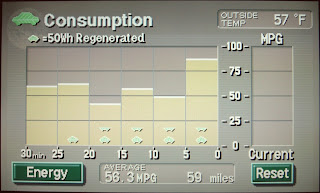
Two things: When you change the display to look at the radio or the climate control, after a couple minutes it switches back to the consumption graph above. So what if I just don’t give a flying hoot about my gas mileage at the moment? Too bad. It’s there, in your face, whether you like it or not.
Point number two: Let’s take a look at the units on this graph, shall we? Miles per gallon on the Y axis and on the X axis? Time. Which means that the area under the curve has the lovely units of minute-miles per gallon. It also means that if the Prius is inching along in stop and go traffic for a full five minutes and not really using its gas engine, the bar for that five minute interval would be up around 100 miles to the gallon, despite the fact that you’ve gone about ten feet. It can make for a misleading graph.
Why not put gallons (or fractions of gallons) on the X axis? Or, another idea - flip the units on the Y axis to be gallons per mile and put miles on the X axis. That way the units for the area are in gallons, and the graph is truly a consumption graph. I think the reasoning against this is that people are more comfortable with MPG; but flipping the scale (low gallons per mile, i.e. good, at the top) as well would get the point across. It’s not like you’re looking at the units while you’re driving anyway.